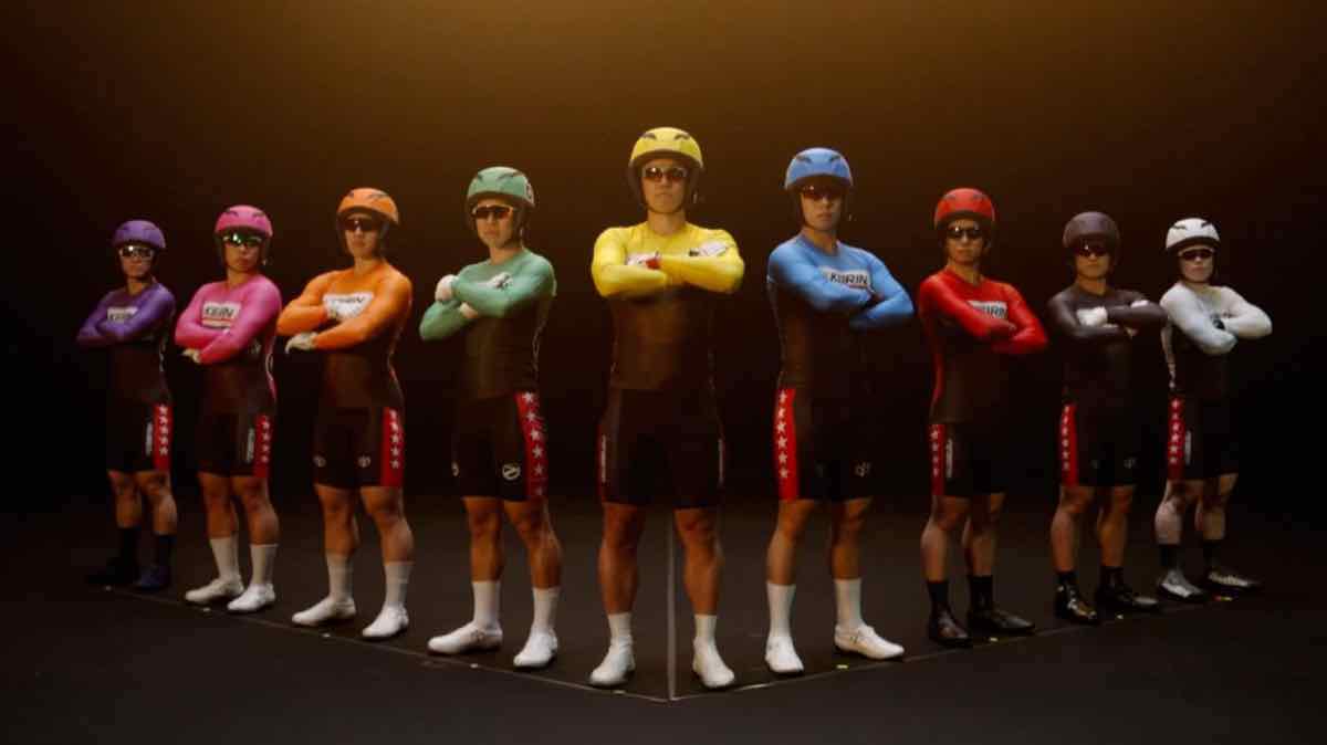
The iconic coloured uniforms worn by Japan’s (male) keirin professionals are to receive their first design refresh since April 2002.
For more than two decades, racers have worn flat-coloured jerseys, intended to improve legibility.
New designs have been revealed by Japan’s JKA, promising stylish design and improved functionality.
The traditional base colours will remain, as will the large printed numbers on the back. Indeed, the casual observer may not immediately notice any change.
But the jersey front will display a new KEIRIN wordmark, with an abstract curve motif representing the final corner and home straight of a racing oval. The chest area will be darker in colour, with a geometric pattern.
The jersey will have a v-shaped neck, instead of the current round neck; with a shorter front and a longer back, logical for a racing position on the bike.
Helmet covers have also been updated, with a three-panel design for an improved fit.
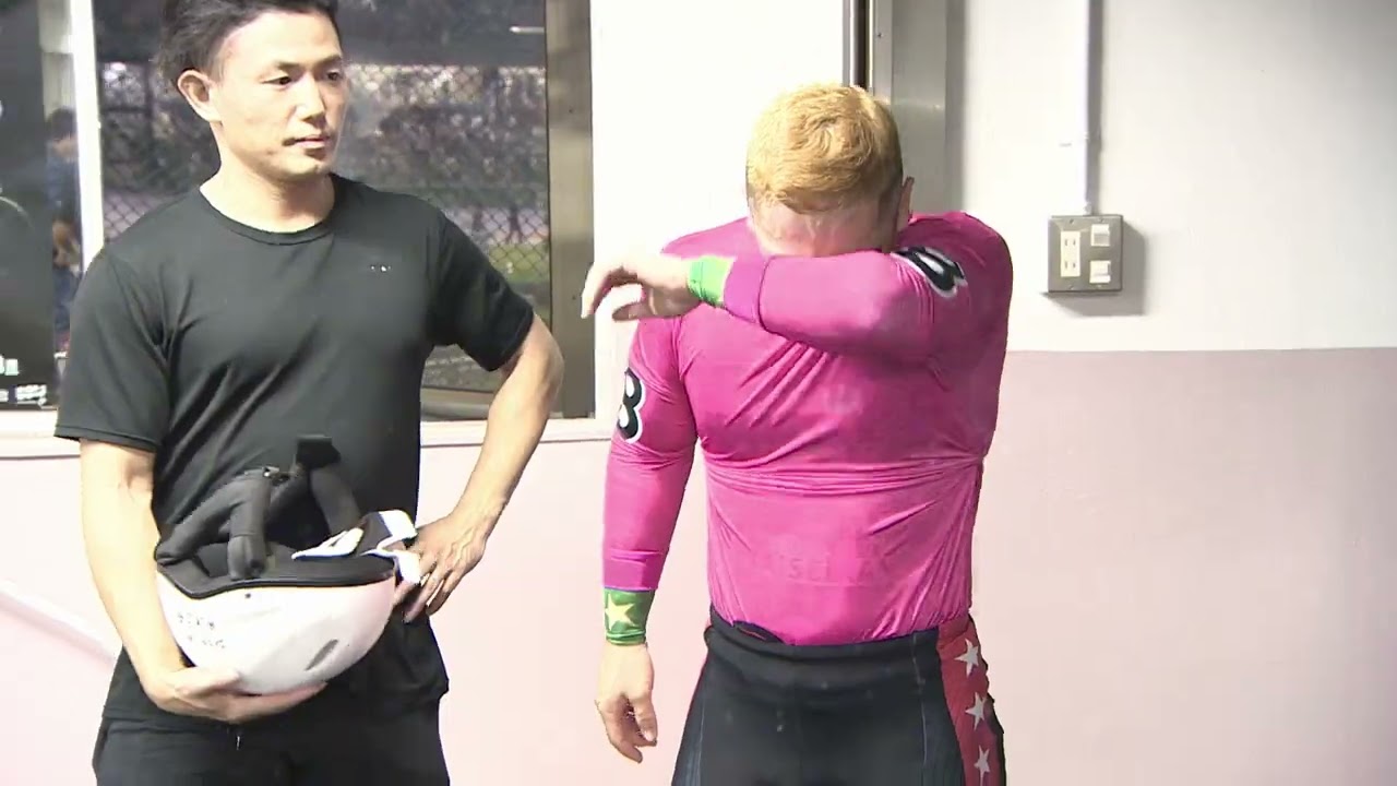
Elite riders will wear jerseys with a gold KEIRIN wordmark, befitting their elevated status, paired with the traditional red shorts.
More Cadence reports that the winner of each year’s Grand Prix will also get a special ‘King Of Keirin’ logo.
The new uniform will be manufactured from polyester derived from recycled plastic bottles, with Global Recycled Standard certification.
The design is credited to Professor Masahiko Nagahama from the Tokyo University of The Arts.

